
CSD App Redesign


UX/UI DESigner
Heuristic Evaluation, Competitive Analysis, Research, Wireframes, Prototypes, Style Guide
Problem:
CSD was looking to do an overhaul of their mobile app. Their current app was removed from the iSO and Android marketplace due to inactivity. CSD was looking to improve the usability, UI Elements, and overall user experience of their app in order to increase usage and gain new clientele.
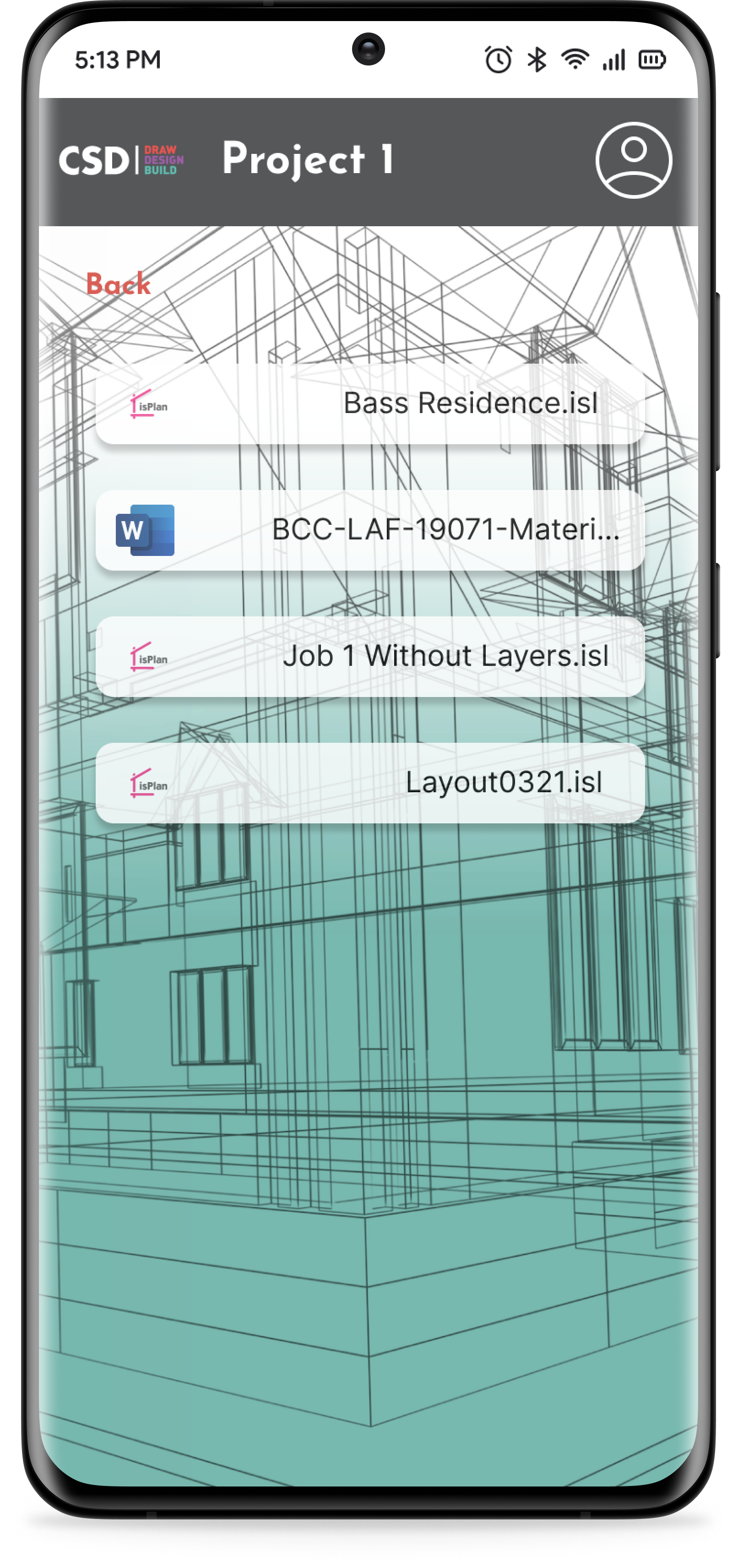
CSD also wanted to add a “My Projects” feature to the app to allow current users to access their current and past projects from CSD’s database right on their mobile device.
Constraints:
The app had been removed from the marketplace and currently had no users. This was a challenge because I was unable to conduct user interviews and had to rely heavily on my heuristic evaluation and competitive analysis.

Solution:
To create a more user friendly experience I had to improve the UI elements of the app, specifically focusing on the accessibility issues identified in the heuristic evaluation.
I developed new screens to login, create a new account, find My Projects and add attachments so users can access this information on their mobile device.


Research
To better understand how we could address some of these pain points and issues identified by CSD, I needed to conduct a Competitive Analysis to see how other companies are solving these issues and what these companies may be missing that CSD can use to gain an edge on their competitors.
I conducted a heuristic evaluation of the existing app to identify any violations and provide solutions to improve usability.
What I Learned…
1) Their current app has some major accessibility issues that need to be addressed in order for users to navigate the app efficiently and effectively. Font sizing is too small for a mobile app, and button sizing is too small and difficult to click.
2) The UI is outdated and one dimensional. Color choices and typography don’t match the website and feels like a different company altogether.
3) Error handling issues and users getting misinformation due to improper inputs and generated results.
4) Results page includes a lot of information and feels crowded and difficult to read.
Wireframes to prototypes
I began by improving the top header bar. I removed the hamburger menu and added the CSD logo that functions as a link to their website. I also added a profile button to give the user access to their profile as one way to access “My Projects”, edit personal information and learn more about CSD.
Then I began to tackle the issue of adding a new “Login” and “Create New Account” pages. I wanted to keep these pages as simple as possible to allow the user to gain access to the CSD database quickly and easily. I also wanted to provide an option for users to skip the whole login process and still be able to use the app for the Span Chart and Web Hole features.
Next, I focused on improving the landing pages for users, guests, and the user profile. I wanted to keep button sizes large because many of the users will be accessing this app in the field on a job and mostly from their phones. I also did this to the attachments page for the same reason. I kept the layout for all these pages similar for each type of user to keep it familiar and easy to use as a new or returning user.
Finally, I addressed the inputs and results pages for Span Charts and Web Holes. I wanted to limit the amount of clicks a user needed to fill the inputs while making it easier to navigate and see. I increased button size for the inputs and split the Span Chart inputs into two pages. I changed the “Minimum Span” from a slide bar to manual inputs for more accuracy. The results page needed to stay similar to what they already use because this is how the industry provides this information. I was able to increase font size and spacing to improve accessibility.


Style guide:
CSD needed to develop a mobile style guide to match their website. Their current app had issues with the typography, font size and color palette. I increased the font size to 24px for headings, 16px for sub-headings and 14px for body text to meeting WCAG requirements.
I took the existing color palette from their website and software and used that to develop a more in depth color palette with more shades, tints and tones.

Outcomes:
With these improvements to the CSD app we can give the users a positive experience where they are more willing to come back and use the product again. With the implementation of the “My Projects” feature, CSD users will have access to their projects from any location and it will allow them to use CSD wherever they are.