LEvelup

LevelUp is a YMCA affiliated mobile website that allows youth to access lessons to teach them tangible life skills, such as, how to build your credit score, how to get health insurance, how to fill out a rental application, etc. in a fun and engaging way to help young adults be successful in setting up their futures.
The project:
Primary Contributions: User Interviews, Competitive & Comparative Research and Analysis, Journey Map, Personas, User Flow, Wireframes, User Testing, Prototypes, Presentation
3 Week Design Sprint / Mobile Website Design
Design Role:
Project Manager, Researcher, UX/UI Designer
Tools:
Figma/Trello/Slack/Adobe Illustrator
Project Overview
or
-
Young people’s lives today are more hectic than ever, so devoting time to learn a life skill like how to fill out a rental application or change a flat tire only comes out of necessity. Young adults are often not seeking out this information on their own and if they are, the information they are finding is unapproachable and tedious to get through.
-
In a study done by The Pew Research Group in 2021 looking at mobile phone ownership, they discovered that 100% of respondents ages 18-29 own a cellphone and 96% of those cellphones are smartphones.
This key insight led our team to lean toward a mobile friendly solution.
-
With no previous or similar product to reference we were tasked with building this mobile website from the ground up.
-
To address our users' need for an engaging way to learn about life skills, we designed LevelUp, a mobile interactive website for learning life skills. We believe this is the best solution because it's the most accessible platform for our users. Our mobile website allows any user from any device to access this information and start preparing for adulthood.
For this interactive website we designed a feature for customizing lesson formats- we wanted to make this mobile website accessible by allowing users to access video, audio, and written formats of each lesson. Users can choose to view any number of the available formats based on their preferred learning style.
We also designed a feature for asking questions about the lessons. With people’s need for credible sources in mind, we created a Q&A section. This allows users to view previously asked questions or to ask their own questions and receive answers from verified YMCA expert-adults they can trust.
Our main solution is to gamify the experience so that users who need an engaging way to learn life skills have an alternative method to accessing this information. Users can earn prizes to customize their avatar by completing lessons.
With all these solutions we believe that we can better equip young adults with the knowledge and skill set to be more prepared for the everyday challenges of adulthood.
The Design Process:

User Research
To better understand users' needs we conducted user interviews. We followed two different types of research, qualitative and quantitative. Here are our findings…
Young adults find the current resources unapproachable.
When learning life skills, young adults typically go to people they trust for insight.
Young adults aren’t motivated to learn life skills until they become necessary.
Young adults like to learn on digital platforms when they are fun and engaging.

Looking at these takeaways we were inspired to develop the best solution for their pain points and problems and our findings better anchored us in the design process.
Competitive Analysis


In our competitive analysis we looked at some competitors to our mobile site to see what they were doing well and what they might be missing. We looked at Masterclass, udemy, and Duolingo. We looked at how these platforms onboarded new users, how they customized the learning experience and how a user would track their progress.This part of the research helped us see what users struggled with the most, what they disliked and what they enjoyed.
Key Findings:
None of the competitors offered more than 2 ways to access the information for different learning styles.
All had a way to track your progress.
Two offered ways to look for specific lessons.
Two offered previews of the lessons before you take the lesson.
Personas
For this project we created 3 personas - a primary, secondary, and tertiary. These personas were created to paint a picture of someone who uses our product. They helped us connect and empathize with potential users to better understand why LevelUp is the solution they need. Although these personas are three very different users we found that they all shared some common needs, goals, and frustrations.
They all want an engaging way to learn
They have unique learning styles
They want to improve their lives
Casey
Casey is a 21 yr old living with her parents in L.A. She recently got her first salaried job and is excited to get her own place! She started looking at rental applications online and feels overwhelmed because she does not understand all the language used. She sought answers on the internet, but quickly lost interest because the results were unapproachable and boring. She can’t ask her parents for help because they don’t speak English. She needs an engaging way to get credible information on the process of applying for housing in language she can easily understand.

-
A credible source of information on how to complete housing applications
Explanations in a language she is familiar with
Free or very affordable access to information
-
Move out of her parents house
Feel more confident in her abilities to navigate adult responsibilities such as increasing her credit score
-
Unfamiliar and intimidating jargon on housing applications
Unable to rely on people in her life to help her with these skills
Jessica
Jessica is an ambitious single mom who would like to be able to provide more for her toddler. She wants to provide more financial stability for her family and improve her career but doesn't want to feel judged by asking questions she feels like she should already know. Jessica is very busy with her job and taking care of her little one. She needs to fit her learning in while on breaks or during any other precious time she’s idle. She has dyslexia and is a visual learner so videos are best for her. She finds that she is more likely to want to come back if the learning feels fun.

-
Different options to learn most efficient and effectively
A way to break up her lessons into manageable chunks to be able to pick up where she left off
-
She wants to advance in her career to feel less stressed with money
More time to spend with her child
Feedback while she learns so she knows she’s on the right track
-
She has a hard time finding alternative ways to learn with her dyslexia
She sometimes feels foolish asking questions she feels like she should already know
Needs a remote or online setting for learning
Journey MAp
Creating a journey map helped us better understand user expectations and their experience learning a new life skill without the LevelUp mobile website. With the Journey Map we were able to see more accurately when/where this problem exists. As well as identifying the attached emotions to those interactions.
By better identifying where our users' pain points and frustrations lie we can decide where in their process the LevelUp app can be most effective in improving their user experience.
Problem Statement
Our problem statement gave us a description of an unsolved problem our users are currently encountering. We gleaned this information from user interviews, user research, our personas and their journey maps.
Casey finds the existing resources on how to navigate housing applications tedious and unapproachable - she struggles to retain the information. She needs an engaging way to learn about life skills such as applying for housing because she wants better options for her living conditions.

User Flow
In our user flow we are walking the user through the actions and decisions they will take when interacting with our design solution. This helped us begin to envision what the user may need to interact with our product. For our user flow our scenario for Caseys was:
In this scenario, Casey just got her first salary job and is ready to move out of her parents house. She is uncertain about some of the language and information on the application so she goes to her YMCA mobile site to take a lesson on rental applications. This is how she would go about taking that lesson.

Wireframes & prototypes

Once a user flow was established, our team came up with ideas to begin sketching out some low fidelity wireframes. After making adjustments and deciding on a final solution, we created some mid-fidelity wireframes. This phase helped us better understand our vision for the solution - our blueprint. By creating a mid-fidelity prototype we were able to test our design solution, find any pain points or problems and make final edits.
What we were looking for:
Can users effectively navigate the mobile website?
Can a user choose a format for the lesson that best fits their learning style
Did the user feel engaged throughout their experience?

Usability Tests
After creating our first Mid-fi prototype we used it to run some User tests. We made some Tasks to see if users could locate key features in the Lesson portion of the app, and then to evaluate certain features of the interactive Knowledge check.
From the Metrics we found that there were some issues with how the lesson page was formatted. The Q&A section was ambiguous and there was key information missing such as who posted the last question and when it was originally posted.
Other incidental findings were some issues with text contrast design on the lesson browsing page and some unclear feedback on how to continue when you answer a question wrong in the knowledge check.
final Prototype
Using our prototype we were able to demonstrate the users journey through our design and articulate where and why our solution is helpful to the users. These are some of the screens our user would see while taking a lesson on LevelUp.


Landing Page:
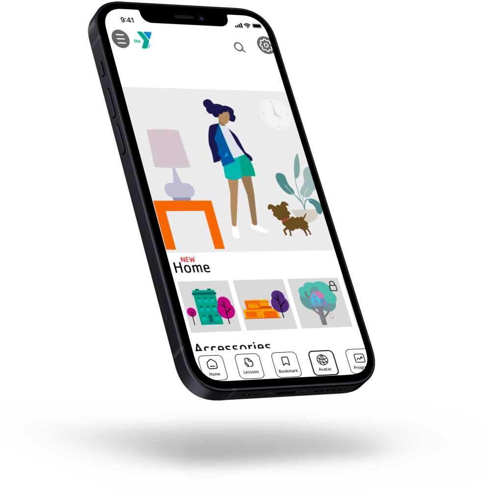
When a user opens the LevelUp mobile website they will be directed to their homepage. With lessons in progress and the bottom navigation bar the user has a plethora of life skills at the tip of their fingertips.
Lesson Library:
Users select a lesson from the lesson library. This is where the user can find life skills that will make the challenges of early adulthood easier.
Lesson Page:
Lessons are offered in multiple formats to cater to users' specific learning needs and styles. This gives the user the highest probability of retaining the information from the lesson.
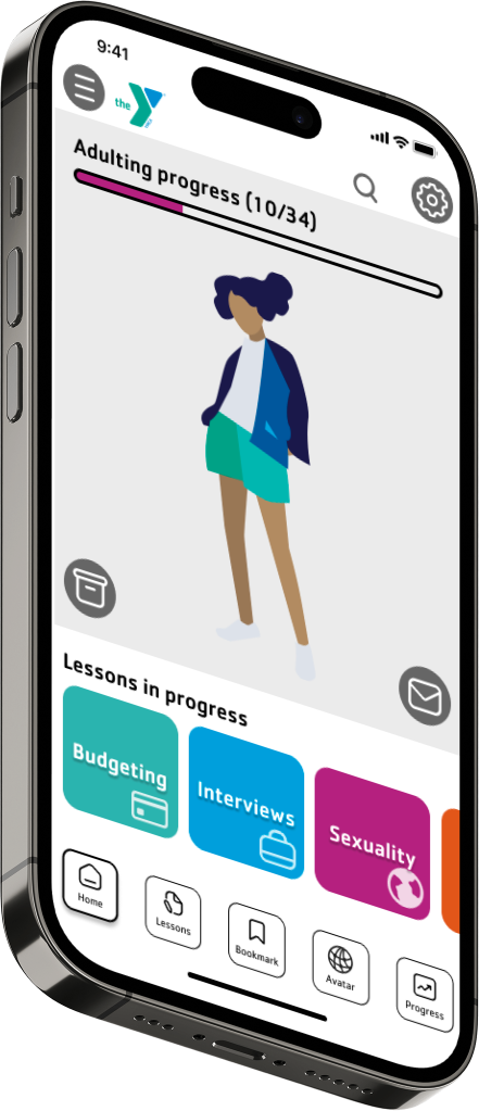
Avatar Page:
Users can customize their avatar with rewards earned by passing “Knowledge Checks”. The avatar feature and available “upgrades” and rewards will encourage the users to return to the site to continue their learning rather than waiting until it's necessary to do so.

Knowledge Check Page:
Users can test their learning with knowledge checks that earn their avatar rewards. By providing a knowledge check users get to review and clarify the information from the lesson in an engaging and entertaining way.

Outcomes
With the LevelUp mobile website, we believe we can better prepare the youth for the everyday challenges of adulthood. By providing the building blocks, these life skills, young adults will have what they need to go out into the world and thrive!